Wednesday, August 14, 2013

Anthropologie Inspiration


In my first blog entry, I mentioned wanting to post inspiration from great store merchandising. Of course, the first store I want to write about is Anthropologie- the mecca of great visual merchandising. I think that Anthropologie’s dedication to great display is amazing- while many stores cut their merchandisers when the economy tanked, Anthropologie has continued to execute gorgeous store design. They actually don’t spend any money on marketing (crazy). Here’s what the president of Anthopologie, Glen Sent, says about that: “One of our core philosophies is that we spend the money that other companies spend on marketing to create a store experience that exceeds people’s expectations. We don’t spend money on messages- we invest in execution.” Isn’t it refreshing that the emphasis is put on good design?!?
So what makes Anthropologie different and special from a merchandising standpoint? Here are the main things:
1.       Store Design- the 92 Anthro stores were designed by Pompei A. D. The stores are anything but generic- “The stores incorporate rich, sensual, and engaging environments that integrate elements of the local culture in a contextual manner so that no two strores are exactly alike.” Many stores are housed in historical locations that add to the character (i.e. the Rockefeller Center store is housed in an old theater, the London Regent Street location in a billiards hall). The overall store experience of the customer in the store is important for Anthropologie- where for many stores, the merchandising of each product the emphasis is.
2.       The Layout- On the home side (which, as a home merchandiser, is what I care most about), the product usually goes from living room, to kitchen, to bedroom items. Much like a guest would walk through a house and become more comfortable, this is how Anthropologie successfully lays out their store. The store is also very open and allows for wandering. “Anthropologie is famed for the informal layout…This layout includes a sculptural “arcade” of vignettes, unique floor fixtures, and furniture. The informal layout gives each store the flexibility to customize its setup in order for the Anthopoloogie shopper to explore its flea-market treasures.”
3.       Fixtures- Anthropologie uses unique items to display their product- from salvaged tables to antique crates. They even have a “found objects” buyer who finds these fixtures and “scours the flea markets of Western Europe to find vintage tables, dressers, and other artifacts upon which to display the merchandise.” Sounds like a fun job to me! In addition to the large fixtures being from flea markets, the merchandisers at each store comb the flea markets for small objects to help the merchandise shine (this article at msn has really great pictures on  this)
4.       Store Windows- it’s so obvious (hopefully), that Anthroplogie’s windows are unique and beautiful that it’s almost silly to mention. Here’s what they do great with the windows: they are visually appealing, they are over the top, they commonly use recycled materials, they are handmade, and each store’s is unique.
While I was in London in the spring, I took a few pictures of the Regent Street Anthropologie.

I love this little vignette! From the stack of trunks to the ecelectic wall hangings, to all of the knick knacks of the table I think it’s perfection. And quirky!


This is a picture I took because of the room divider. What a great way to make a bed feel special! The divider is made of canvas on a metal support system with the canvas painted (that looks adjustable). Sounds like a fun DIY project to me! Angling the bed also helps it feel special.
I know that when it comes to Anthropologie pictures, these aren’t the most exciting, but I am really trying to not post any pictures that I didn’t take (I keep hearing about bloggers getting sued for using pictures they didn't personally take and that had a copywrite on them).
To end this blog, I have to say that I loved writing it! I mean, how can you not love a company that truly values their creative staff?!? Plus, I love that Anthroplogie has stepped outside the box and it’s worked for them. I also love reading about their display philosophies and thinking about how I can implement them with my displays. Oh Anthropologie!
Sources for text:

Monday, August 12, 2013

Book Mobile for Back to School Merchandising


At my work, we have a bunch of backpacks on sale for $4.99. Even better than that, for every one that is purchased, one is donated to a local shelter! Since it is back to school time, I wanted to create a display that highlighted these backpacks. I remembered seeing this picture of book mobiles on Pinterest and decided to recreate. I looked all over Pinterest for instructions, but couldn’t find them (all of the gorgeous book mobile pictures were from Etsy that I saw). <iframe src="http://rcm-na.amazon-adsystem.com/e/cm?t=anthrogirl-20&o=1&p=8&l=as1&asins=1584799099&ref=qf_sp_asin_til&fc1=000000&IS2=1&lt1=_blank&m=amazon&lc1=0000FF&bc1=000000&bg1=FFFFFF&f=ifr" style="width:120px;height:240px;" scrolling="no" marginwidth="0" marginheight="0" frameborder="0"></iframe>
The book The Repurposed Library by Lisa Occhipinti has a tutorial, but my local library didn’t have it (note, affiliate link used). So here’s what I came up with:

1.       Buy some hardback books from your local thrift store. I bought three for $1 each (aka, this is a pretty cheap project)! You will also need double stick tape, scissors, and a stapler.

2.       I started with using scissors to cut out each page. I soon realized this would take forever, so I used the scissors to score the front and back book pages and ripped out the entire inside of the book. Much quicker!

3.       After some trial and error, here’s what I found worked best- rip off a page out of your book, use double stick tape or glue to adhere the page in half. Make sure to not fold the page so it is the shape of a tear drop.
4.       Staple that page into the binding of the book on the right side. Repeat a second time for the left side. Since you hang the book by the binding, these staples won’t be obvious (p.s. this picture is from when I was still trying to figure out the best method- disregard the pages that aren’t folded). 

5.       Keep adding pages by taping to the already stapled in page- I liked 9 pages for the base of the book mobile. Staple again in the center so you have a good solid foundation to work with.

6.       Keep adding pages by taping in the tear drop pages at different intervals. I worked with the book flat on my desk- make sure to hold the book up to see how the pages fall so you can see where to add more pages. If you search “book mobile” on Pinterest, you can see different examples so you can try to recreate your favorite.

7.       Repeat for each book- making the mobiles took me about 20-30 minutes per book and took up quite a bit of tape (you’ll need at least a roll of double stick tape for three books).
Now came the fun part- the installation! The store I was working in has really high ceilings, so I used a 2’x4’ grid attached to chain and s-hooks to lower the ceiling. I really like these grids for fun displays like this- once installed you can use a step stool to hang whatever you are hanging really easily (I also used a grid here. I got mine from a local storedisplay store, but I am sure Home Depot has something that would work). I used twine to hang the books and added a few props like a $5 chalkboard (from Hobby Lobby) and some pencils to complete the back to school theme. I put one of each backpack on a chest with a bookshelf of more of the backpacks behind it and I was done! I am very happy with this display and have heard that the backpacks are selling great. If I was to change anything, I would add more books. It was a fun excuse to learn to make something new. Are you creating any displays for back to school?


Thursday, August 8, 2013

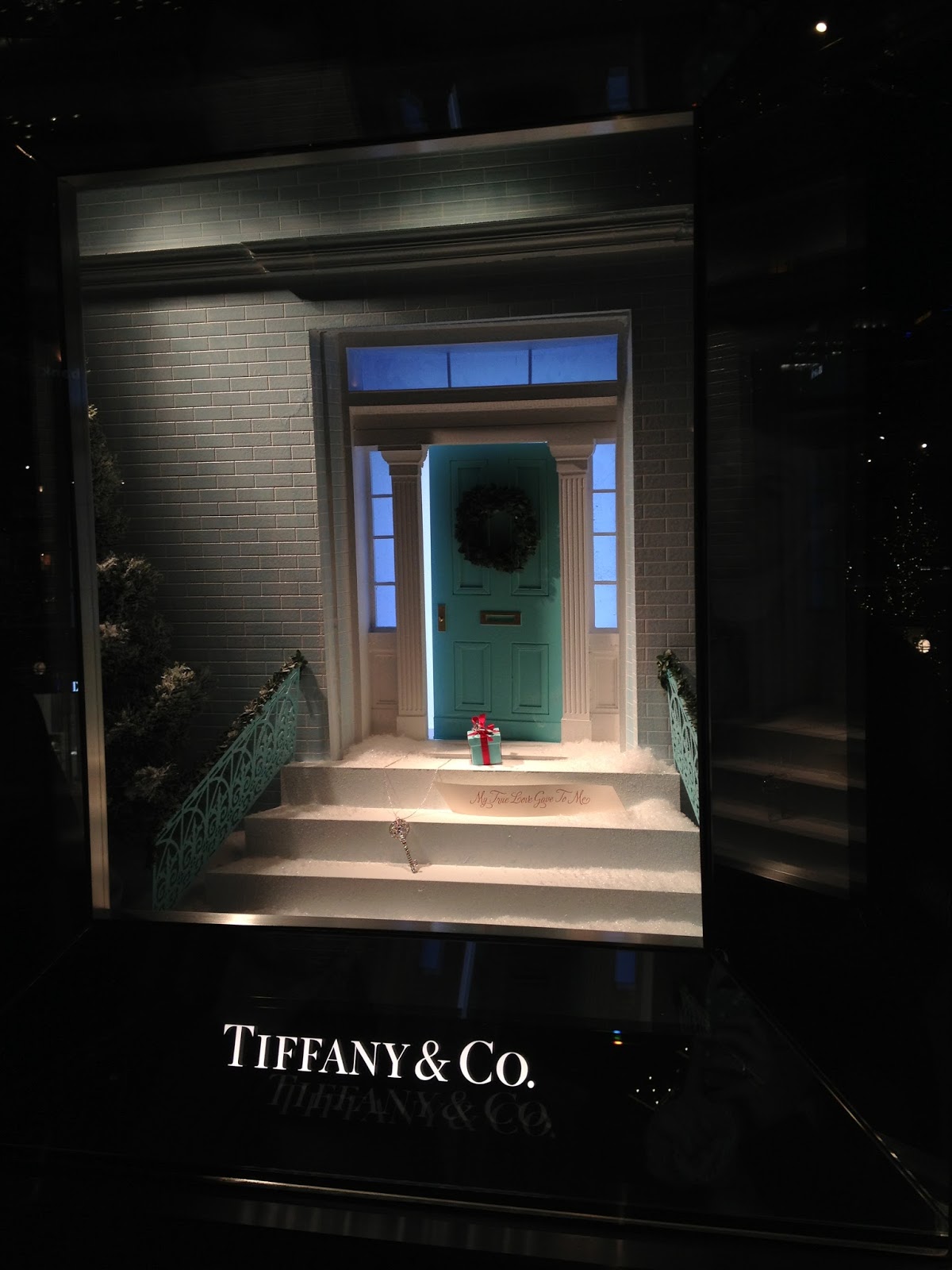
Gene Moore and Tiffany & Co.


Hello fellow merchandisers! Today I wanted to talk about someone who revolutionized the world of store windows. Now, I love merchandising with furniture/interiors, but there are some great ideas that came from Tiffany’s windows and can be translated to any store. In the history of Visual Merchandising, one of the first great window dressers was Gene Moore. He decorated 5,000 windows for Tiffany’s while working there over his 39 year career. He took the windows from boring linear arrangements to creative and awe-inspiring works of art. Before working at Tiffany, Gene Moore was at Bergdorf Goodman. “At a time when the theory of window display was to cram in as many mannequins displaying as much merchandise as possible, Mr. Moore created interest simply by clearing away the clutter and limiting a single window to one or two mannequins, but always in such a startling pose of situation that they were sure to draw attention.” After leaving Bergdorf Goofman, Gene Moore moved on to Tiffany & Co. where he continued to revolutionize the art of window display. So what did Gene Moore do at Tiffany that was so magical?

1.       He worked with a tiny space- Tiffany windows are 3’ high, 22” deep, and a maximum 4.5’ across. Even in that small space he caused stopped people in their tracks.

2.       He used intimate objects for his displays that weren’t “product”- from a toy truck, burlap, moss, sheet music, bricks, and fishhooks, to lettuce nothing was too sacred to pose with the diamonds.

3.       He wasn’t trying to sell- “Don’t try to sell anything; we’ll take care of that in the store” is what the chairman of Tiffany’s told Moore when he started in 1955. (Kind of reminds me of Anthropologie’s emphasis on having a beautiful environment).

4.       He could see beauty everywhere- “I show people things they’ve looked at before but really haven’t seen- like dirt. Dirt can be beautiful” said Gene Moore. He also saw beauty in broken glass and ice. One of his windows showed a block of fake ice and leaning against it was a pair of tongs that pinched a large diamond.

5.       He used actual art in his displays- Gene Moore loved modern art- he used concepts or actual works from Jasper Johns, Alexander Ney, and Andy Warhol. He wanted to be an artist when he grew up- that love of art was apparent in his windows.

6.       He had one idea- this single idea was designed to catch the attention of the passer-by. He kept it simple and made people stop with that one idea.

So here’s what I take from Gene Moore- don’t take window display too serious! He used fantasy, beauty and wit, and combined the extraordinary with the ordinary to create miniature worlds. I can do the same with furniture (P.s. Here's a movie that's a quick snap shot of this). Also, there is major importance in a good store window! It can stop pedestrians and get customers to think about your goods in a new way. Moore’s motto was “make people stop” I can use his ideas to do the same.

Another great resource on this subject is the book GeneMoore wrote himself “My Time at Tiffany’s.” (Note, affiliate link used). Sounds like a good read to me! He chronicles his windows and how he became the window dresser for Tiffany.

I have also included some Tiffany display pictures I have taken in London and Salt Lake. I love those tiny windows!

Sources for Text:
The Economist
People
NY Times

Saturday, August 3, 2013

To Market To Market- Las Vegas Furniture Market Four Hands


I was lucky enough to be able to attend the Las Vegas furniture market. Whenever I was inspired to create a display, I took a picture. So I thought that I would share a few from the first showroom we toured- Four Hands.


The front windows were super impressive. I loved the branches they used to almost create a canopy of the huge linen sofa. I also think it was interesting that they put moss on the wall as a backdrop to the mirror. Their theme seemed to be: bring the outdoors in. They always to an amazing job with lighting to add that extra element.

I have started to see the use of the malachite as a motif in homes. (Little Green notebook showed lots of gorgeous examples here), so I wanted to take note of this wallpaper- complete with creepy/vintage mermaid.

Another outside in picture- check out those floors! This vignette was raised with stone pavers and moss. Very messy, but so pretty!


Sometimes tapers can look super dated- I like how they melted some of the wax. Makes them look less perfect and more interesting.

Arrows- so trendy right now. But they are sculptural and I liked how they put them in the wall (I also loved Emily Henderson’s in a vaseon her mantle)

I’m still not sick of industrial lighting- I love the theatrics of it and how it is both a light and art.


Raingutter hanging planter? Genius. I even got a close up because I thought it would be fun to recreate. Would be pretty easy to DIY with cooper rain gutters, a drill, and long bolts.
I really liked the use of all of these little glass vases. It feels collected and interesting- makes a statement and would be very easy (and expensive!) to do.
At this market, I saw lots of vintage racquets being used as art. Maybe my parents have their old tennis racquets that I can steal for a display? Or a thrift shop?
So there you have it- and all in one shop!!! Beautiful furniture + great displays is perfection in my book! One of my favorite parts of market is all of this inspiration I get. I have a fun “back to school” display that I dreamed up during market that I can’t wait to share. Hint, hint, it includes book art!