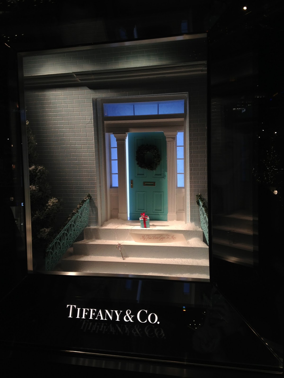
Hello fellow merchandisers! Today I wanted to talk about someone who revolutionized the world of store windows. Now, I love merchandising with furniture/interiors, but there are some great ideas that came from Tiffany’s windows and can be translated to any store. In the history of Visual Merchandising, one of the first great window dressers was Gene Moore. He decorated 5,000 windows for Tiffany’s while working there over his 39 year career. He took the windows from boring linear arrangements to creative and awe-inspiring works of art. Before working at Tiffany, Gene Moore was at Bergdorf Goodman. “At a time when the theory of window display was to cram in as many mannequins displaying as much merchandise as possible, Mr. Moore created interest simply by clearing away the clutter and limiting a single window to one or two mannequins, but always in such a startling pose of situation that they were sure to draw attention.” After leaving Bergdorf Goofman, Gene Moore moved on to Tiffany & Co. where he continued to revolutionize the art of window display. So what did Gene Moore do at Tiffany that was so magical?
1.
He worked with a tiny space- Tiffany windows are
3’ high, 22” deep, and a maximum 4.5’ across. Even in that small space he
caused stopped people in their tracks.
2.
He used intimate objects for his displays that
weren’t “product”- from a toy truck, burlap, moss, sheet music, bricks, and
fishhooks, to lettuce nothing was too sacred to pose with the diamonds.
3.
He wasn’t trying to sell- “Don’t try to sell
anything; we’ll take care of that in the store” is what the chairman of
Tiffany’s told Moore when he started in 1955. (Kind of reminds me of
Anthropologie’s emphasis on having a beautiful environment).
4.
He could see beauty everywhere- “I show people
things they’ve looked at before but really haven’t seen- like dirt. Dirt can be
beautiful” said Gene Moore. He also saw beauty in broken glass and ice. One of
his windows showed a block of fake ice and leaning against it was a pair of
tongs that pinched a large diamond.
5.
He used actual art in his displays- Gene Moore
loved modern art- he used concepts or actual works from Jasper Johns, Alexander
Ney, and Andy Warhol. He wanted to be an artist when he grew up- that love of
art was apparent in his windows.
6.
He had one idea- this single idea was designed
to catch the attention of the passer-by. He kept it simple and made people stop
with that one idea.
So here’s what I take from Gene Moore- don’t take window
display too serious! He used fantasy, beauty and wit, and combined the
extraordinary with the ordinary to create miniature worlds. I can do the same
with furniture (P.s. Here's a movie that's a quick snap shot of this). Also, there is major importance in a good store window! It can
stop pedestrians and get customers to think about your goods in a new way.
Moore’s motto was “make people stop” I can use his ideas to do the same.
Another great resource on this subject is the book GeneMoore wrote himself “My Time at Tiffany’s.” (Note, affiliate link used). Sounds
like a good read to me! He chronicles his windows and how he became the window
dresser for Tiffany.
I have also included some Tiffany display pictures I have
taken in London and Salt Lake. I love those tiny windows!
Sources for Text:
The Economist
People
NY Times
Sources for Text:
The Economist
People
NY Times


No comments:
Post a Comment