1.
It took 10
months to put together the store so they could do it debt free. I know that has
nothing to do with merchandising, but I do think it is smart.
2.
The space is
1500 square feet- they have a studio in back and the 300 sq. foot store in
front
1.
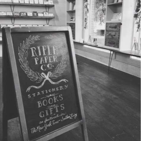
The store
has wood floors, white walls (Benjamin Moor Ballet White), white trim and
custom shelving. I think this is the perfect combination- I have done some new
store planning where I used a similar concept and I should have pictures of the
finished product next week!
1.
The red
pendent lights were from Anthropologie and the furniture is vintage or built by
the team that made the shelves (Hog Eat Hog)
The wood
they used was salvaged or local and they painted the floor with a mix of stain
and milk paint and then topped with wax to create a vintage look.
1.
The custom
shelves around the windows and the card shelves are perfect for displaying the
paper goods
1.
They have a
record player in the shop they play for ambiance (I am loving record players
right now so I think this detail is perfect)

1.
The window
displays are switched seasonally and are so happy and colorful- just like the
cards. Don’t you love the words on the windows?
1.
Rifle Paper
Co. also has a booth at the New York Stationary show. I thought I would include
a few images of the booth as I thought it was inspirational for merchandising
as well. (p.s. one of my favorite images below is the progress shot of the
patted pattern they made for their booth- amazing!)
1.
Lastly, I
love this photo of their studio- aren’t the dark walls delicious?!?

Note, all pictures above are via the RiflePaper Co. Instagram feed.
p.s. I tried my hand at painting
a Rifle Paper Co. inspired piece and pretty much failed. But it was fun to try-
I have never painted with gouache before, but it’s a great medium (and what is
used on the Rifle Paper Co. art). It’s thicker and more vibrant than
watercolors but not acrylic paint. Plus, it can be cleaned up with water.


No comments:
Post a Comment